How to design your dream home? (Part 7)
Next on our list of typologies is ‘modern’, the word may mean different things to different people, but I am thinking of it in terms of the style created by the early modernists, notably Le Corbusier, typified by a functional aesthetic, white walls, strip windows and simple rectangular or circular shapes.
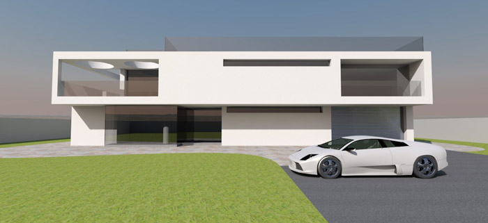
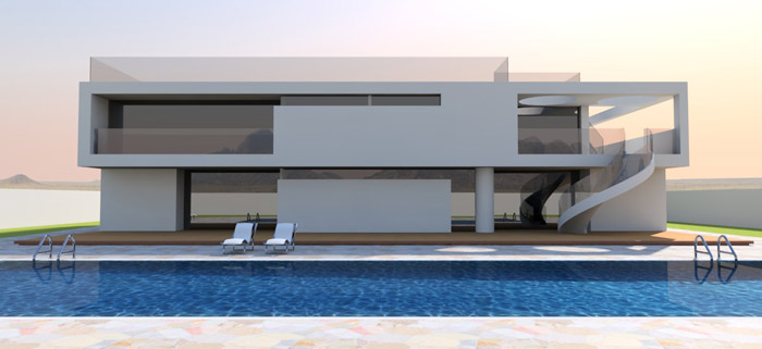
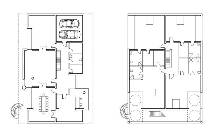
By the end of Part 3 of these blog posts, we had an indicative plan, and some idea of the external appearance. The front elevation more or less designed itself, the rear elevation I struggled with, but resorted to the time honoured way of organizing a facade using symmetry, except it’s wasn't quite symmetrical. The rear had a section of louver in the middle, in much the same way an old car has a grill for the air intake, however while a grill may make a lot of sense on a car, the louvers didn’t make a lot of sense on the building, other than for aesthetics, so I felt the need to rethinking this. I tried many different patterns, the building is more solid at first floor, so it seemed like the ground floor central section needed to be solid too, as if to seemingly hold up the first floor, however that wouldn’t have provided great views out from the lounge, so I was forced to compromise and added windows around the edges of a solid panel, a strip along the top, at the sides and a vertical strip placed off centre, with the wall section to the right changed to a column. The two side returns, I beefed up to make it seem like they too were capable of supporting the weight of the first floor. Consistent with the style I added strip windows to light the bathrooms and other ancillary rooms. Some further consideration was given to the planning layout, with dimensions modified here and there to ensure adequate clearances and sizes, and some preliminary consideration was given to the structural rational, such that forces could be carried down to ground with reasonably economic structural depths, all the usual things a house designer would consider.
I organized the site with a pool, patio area and car park, tailored to this project. Finally I reviewed the front elevation, removing the ground floor projection on the left side, as this appeared bulky when viewed from close up and in order to better match the front and rear elevations. The design still lacks details of the window layouts, and the structure needs some refinement, but generally the form of the building is clear, images below. Let me know what you think in the comments.
Visit our Chinese (中文) website